There is increasing talk about ‘data-driven development’. In this article, DTT explains what data-driven development means in practice and how you can use valuable insights based on data to give direction and priority to the further development of a software solution.
What is data-driven development?
Data-driven development is an approach where decision-making for the (further) development of a solution is based on concrete figures and insights. During the development process, costly decisions are often made based on assumptions, without truly looking at the data. By measuring the behaviour of the users within the solution, you will be able to make well-informed, data-driven decisions on priorities and optimisations, among other things.
How does DTT handle data-driven development?
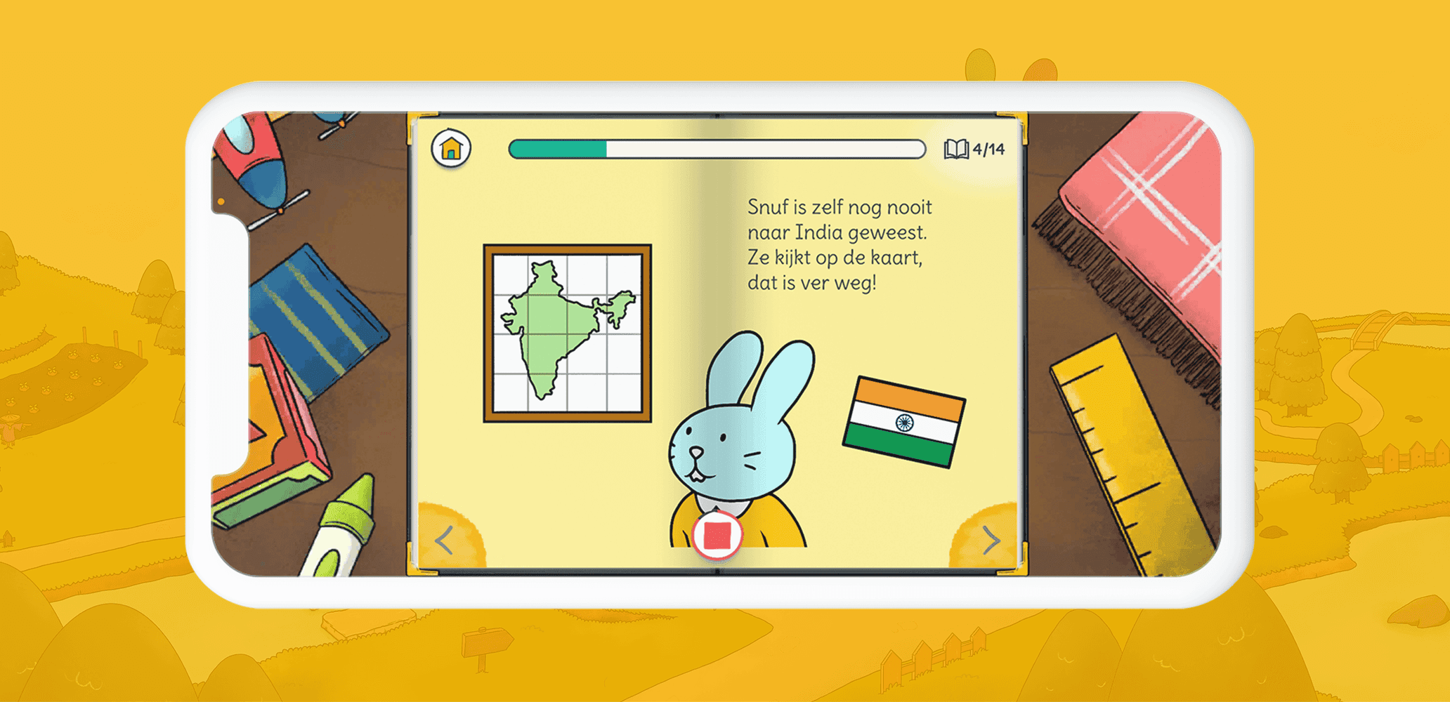
Edu Play Book is one of the apps where DTT has applied data-driven development with the help of app analytics. The development of the app started small, focusing on the basic functionalities, which were then further developed, expanded, and supplemented based on data-driven optimisation and app analytics.
We use Key Performance Indicators (KPIs) to make the success of Edu Play Book concrete and measurable. A KPI provides clear insight into the achievement of your goals. For example, a KPI for your solution could be to generate as many downloads as possible ("acquisition"), motivate users to share your solution with each other ("organic growth"), or retain users ("retention"). In this chapter, we will walk through the KPIs of our in-house app, Edu Play Book, step by step and share the results of each app update.
KPI 1: Achieving a growth factor of 1.5 for the total number of shares within a year
The focus of the first phase was on increasing downloads and users (acquisition). Our KPI: Achieving a growth factor of 1.5 for the total number of shares within a year. This means that for every 10 users, on average, 5 new users are invited.
We formulated this goal using the SMART method. SMART stands for Specific, Measurable, Acceptable, Realistic, and Time-bound. This looked like this for this KPI:
- Specific: We made this KPI specific by naming figures and timeframes.
- Measurable: Formulate a measurable goal (often numerical) and ensure you have the tools to measure your KPIs. To make this goal measurable, we implemented in-app analytics to track how often the app is shared.
- Acceptable: Ensure that the goal is accepted by all stakeholders; without support, you cannot achieve the goal. We ensured that all stakeholders were behind the goal.
- Realistic: KPIs must be realistic. We made this KPI realistic by considering the feasibility of the KPI within the available budget and intended timeline.
- Time-bound: Indicate within what period the goal must be achieved. For this KPI, we set a one-year timeframe.
After drafting the SMART KPI, we thought about the functionalities that would contribute to achieving the goal.
To encourage sharing the app, the recording functionality was introduced. With this feature, users can record a book and share the recorded book with loved ones, for example, via Facebook or WhatsApp. Additionally, a request can be sent to a loved one asking them to record a story. Before the launch of this update, key conversion points were mapped out to measure whether the update led to more organic growth, including:
- From reading a book to requesting a recording;
- From starting a recording to completing a recording;
- From completing a recording to sharing a recording with another user;
- From requesting a recording from a loved one to downloading the app by the person who received the invitation, to recording a story by the loved one and then returning the recording (complete flow);
- From sharing a recording with the person who requested it to sharing the recorded content with other users.

- In June 2019, the app was shared 224 times through app shares (59%) and book shares (41%).
- In June 2020, the app was shared 790 times, with the majority of shares being recording requests (62%) and shares from shared recordings (17%).
- Between June 2019 and June 2020, the total number of shares increased by more than 350%. The goal to increase the total number of shares by a growth factor of 1.5 was exceeded with this result.
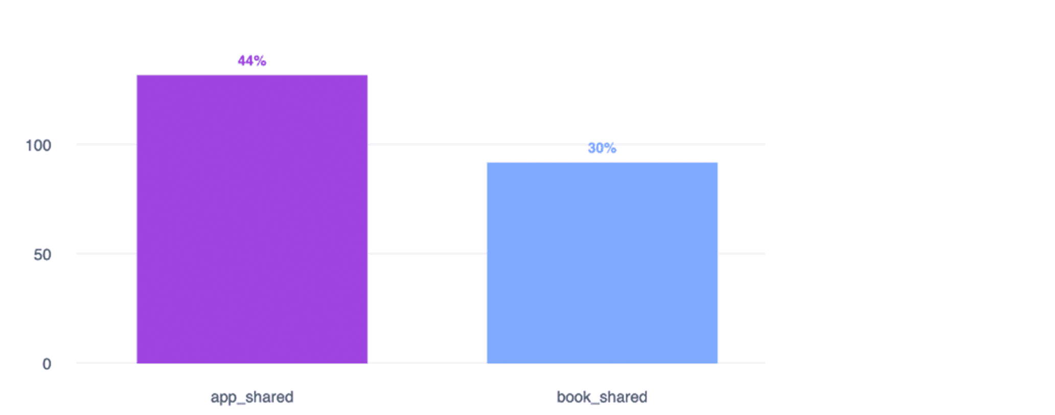
Facebook Analytics, Edu Play Book: Shares distributed by share type, June 2019
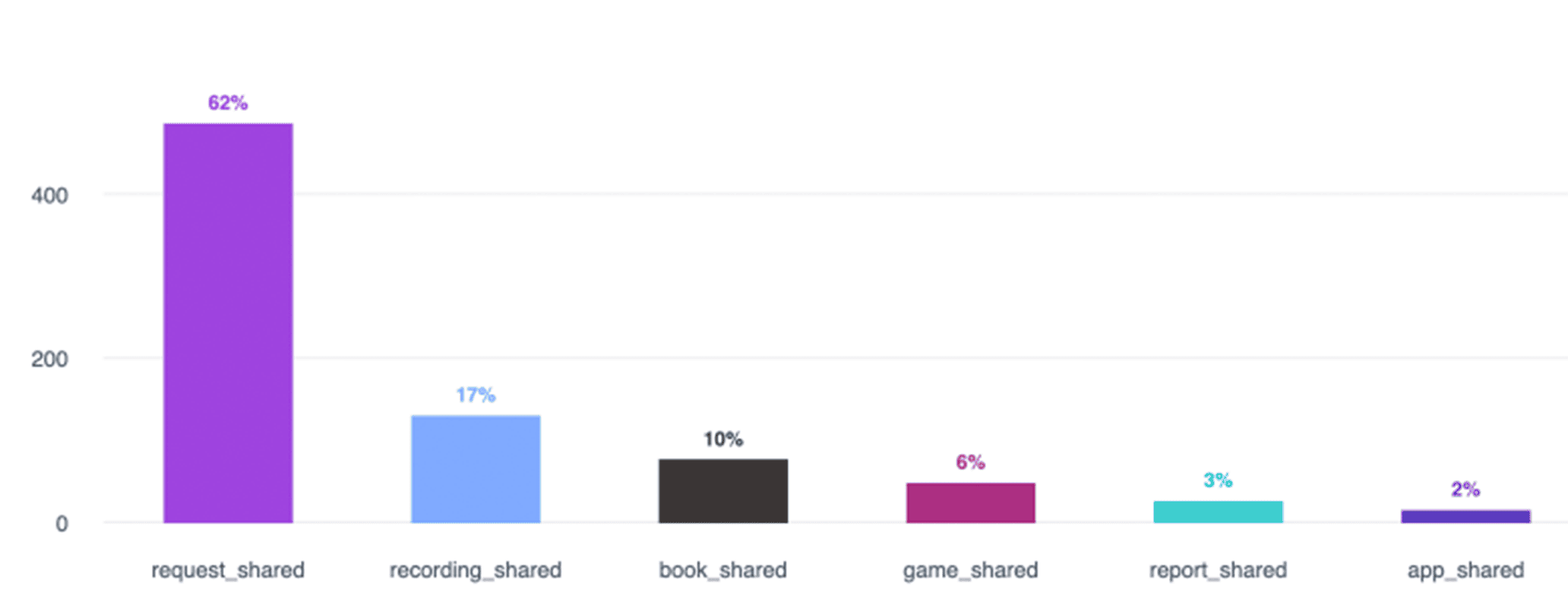
Facebook Analytics, Edu Play Book: Shares distributed by share type, June 2020
The funnel below shows how often in February 2021 the request for a recording was initiated, how often the request was sent, and at what point this process was most often interrupted. Of the 454 users, 143 users eventually sent a request to record a book.
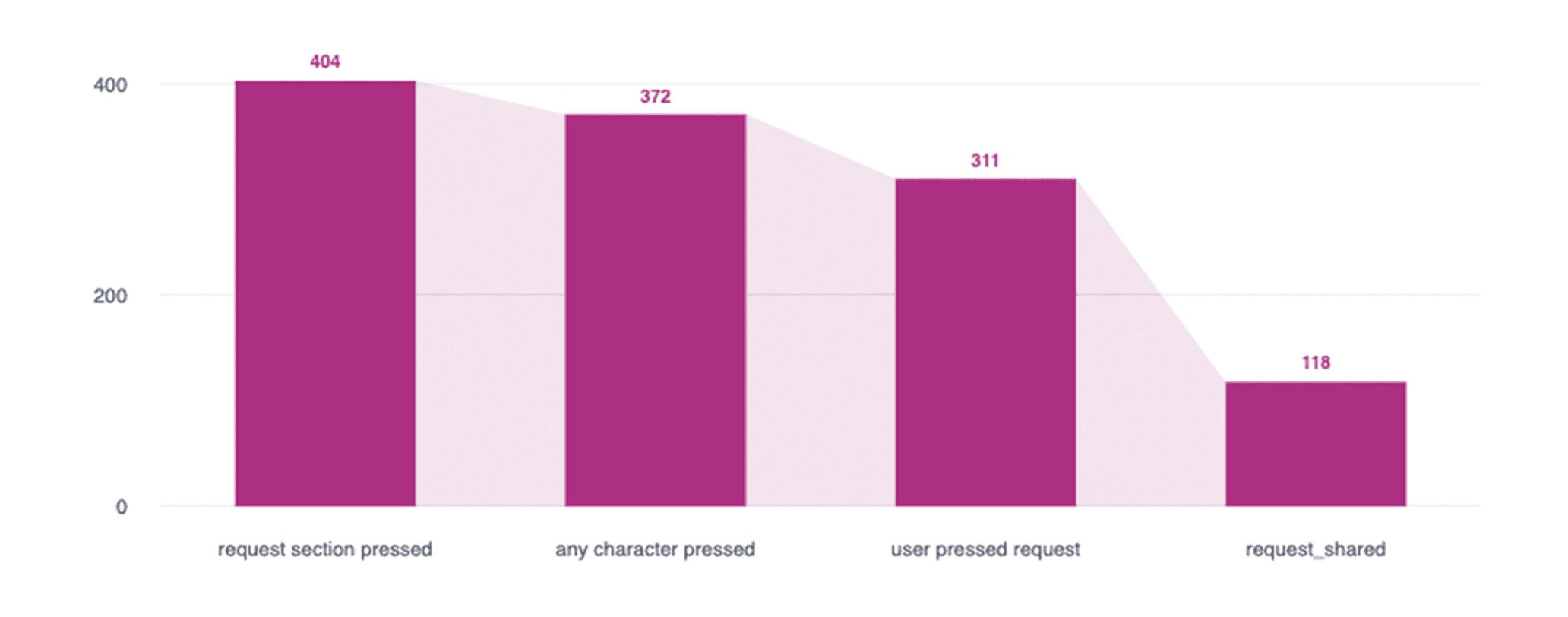
Facebook Analytics, Edu Play Book: Recording funnel, February 2021
The funnel above shows that we lose more than 40% of users between step 3 (clicking on a recording request) and step 4 (actually requesting a recording). Therefore, in upcoming updates, we will focus on optimisation between steps 3 and 4. We know that optimisation at this point in the app has a higher priority and could yield more benefits than optimisation between steps 1-3.
KPI 2: Double the week 1 retention of the app within a year
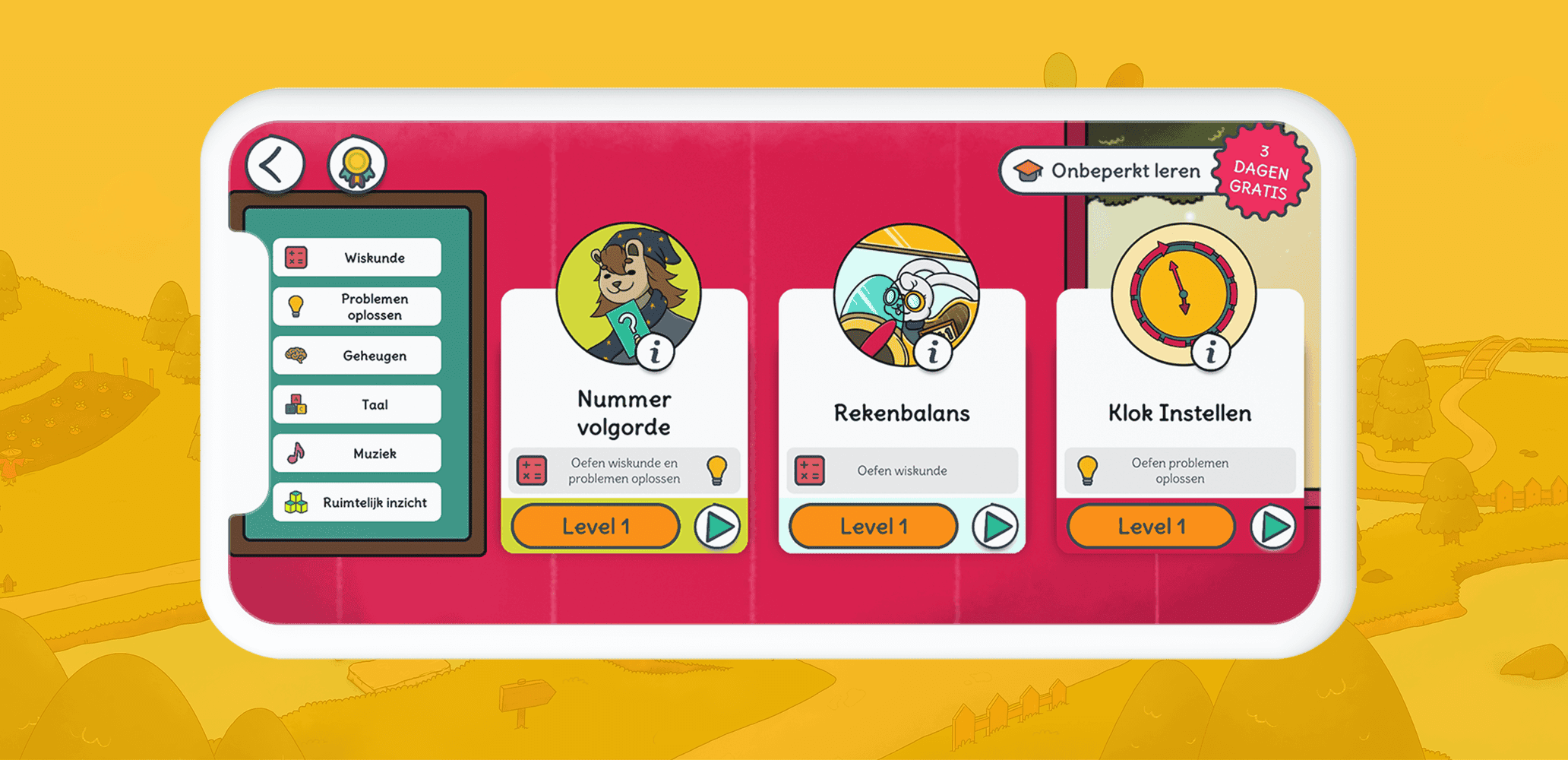
The next goal, after increasing the number of shares, was to improve user retention. User retention means keeping existing users. To stimulate user retention, the following features were added:
- Educational mini-games, come back every day to learn reading, maths, and more;
- Sleep Tight, come back every day for an interactive bedtime story;
- Brushing Teeth, come back every day for an interactive module teaching children how to brush their teeth.
For the features above, key conversion points were once again mapped out, including:
- From mini-game level 1 to mini-game level 2;
- From playing mini-game A to playing mini-game B.
The features to promote retention went live in September 2019. At that time, week 1 retention was 3.23%, meaning that only 3.23% of users were still using the app after a week. By September 2020, retention had increased to 15.1%, nearly quintupled in one year.
KPI 3: Increase user activity to 2500 active users per month within one year
Through Analytics, it became clear that the longer a mini-game level lasted, the more frequently the level was played. Based on these insights, it was decided to extend the levels of new mini-games by making them more challenging. In January and March 2020, longer mini-games were introduced. The chart below shows the increase in user activity after launching the new mini-games.
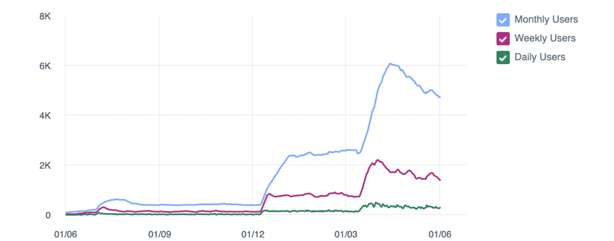
Facebook Analytics, Edu Play Book: User activity, June 2019 to June 2020
The funnel below shows how often a level of a mini-game was started in February 2021, how often it was completed, and the number of users who moved on to the next level.
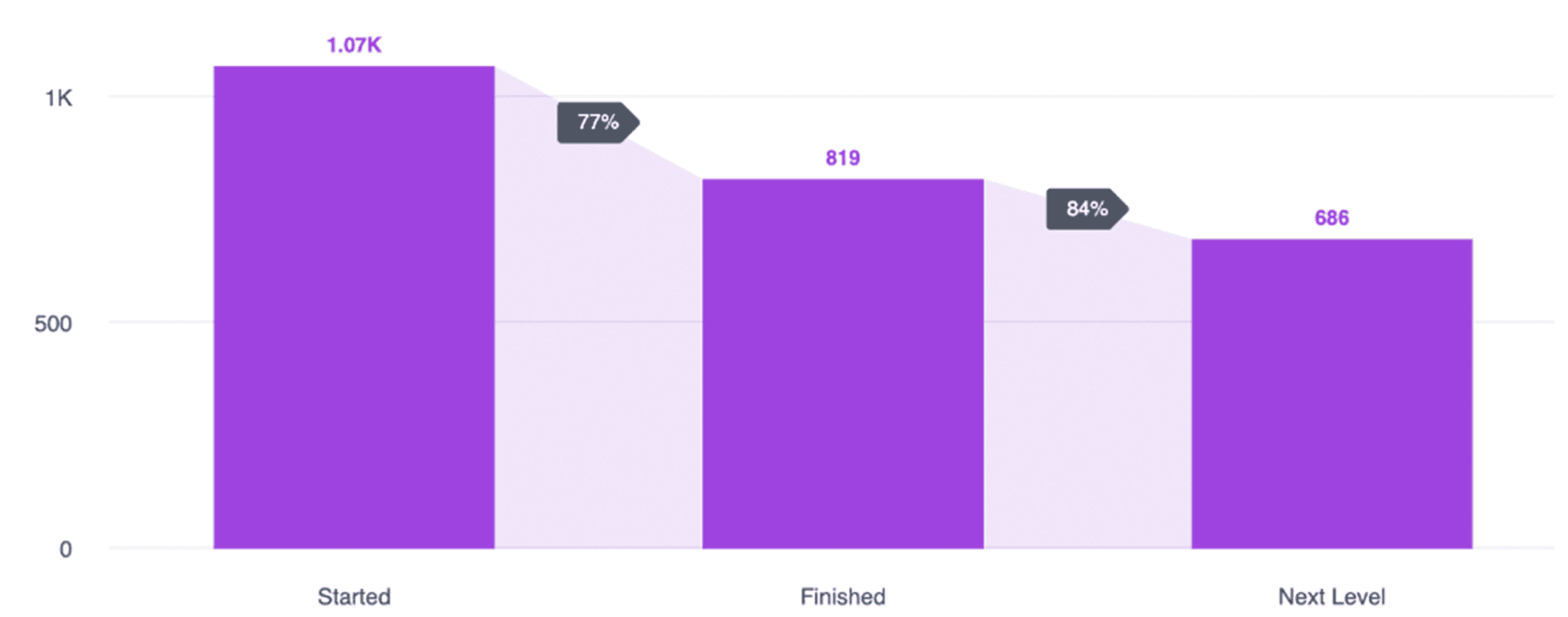
Facebook Analytics, Edu Play Book: Mini-game funnel, February 2020
Based on these insights, it could be argued that focusing on the process between ‘Started’ and ‘Finished’ would be more valuable. More 'gains' can be achieved here than in the next step. In step 1, we lose 23% of users, and in step 2, only 16% of the remaining users.
A/B testing of app icons
An A/B test is a type of split testing in which different variants are tested alongside each other to find the ‘best performing version’ with the highest conversion. For Android apps, it is possible to set up an A/B test in which you can test up to four variants side by side (A/B/C/D). This could include variants of the app icon or screenshots displayed for the app.
Several A/B tests were set up for the Edu Play Book app. The app icon is the first visual point of contact for a user in the app stores. Ideally, the app icon should stand out to catch the user's attention.
In the tables below, we outline the iterations of the app icon and the number of downloads. The higher the percentage, the more frequently the app icon was downloaded.
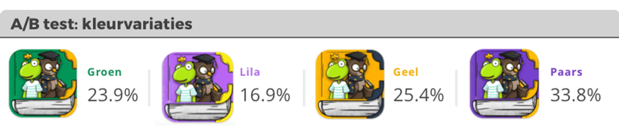
19th August 2019: A/B testing with colour variations
In the first A/B test, the focus was on the colour of the app icon. During this A/B test, four variants of the app icon were tested in the Google Play Console, each with a different colour. The purple variant was the most downloaded option.
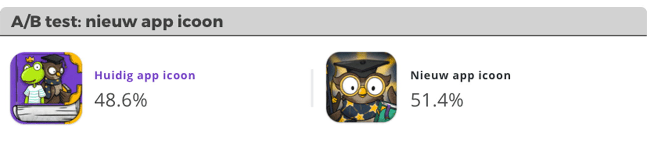
25th October 2019: A/B testing with a new design
In the second A/B test, a completely new design was tested against the most successful variant from the previous test. The results were as follows:
12th December 2019: A/B testing with variations
In the final A/B test regarding the app icon, four variations of the owl from Edu Play Book were tested. Of all four variants, the same app icon remained the most popular with 28.9%.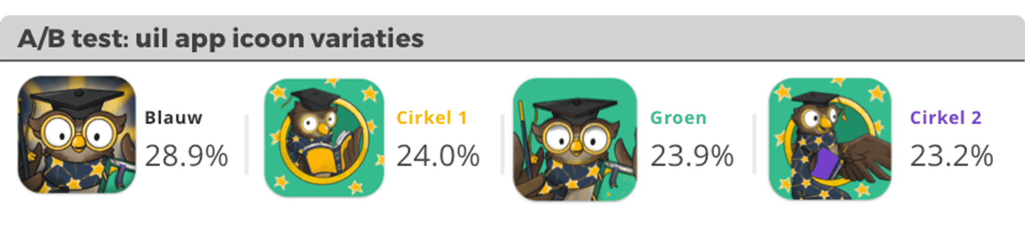
As can be seen, we achieved substantial 'gains' through the A/B tests, which led to a significant and structured increase in app downloads.
Case: VoNo
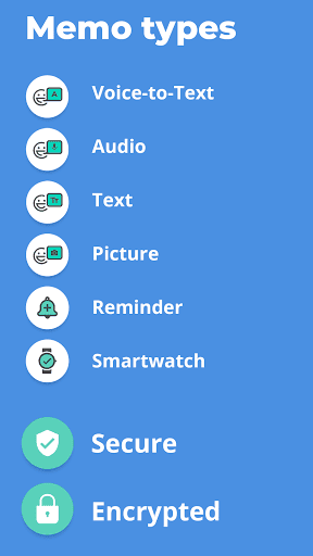
For the VoNo app, DTT frequently uses A/B testing in the Google Play Store. In addition to app icons, it is also possible to test other elements from the Google Play Store listing, such as:
- App icons
- App screenshots
- Feature graphic
- App video
In this chapter, we will go step by step through the results of various VoNo A/B tests.

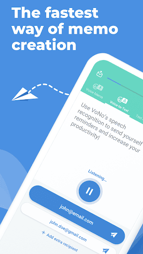
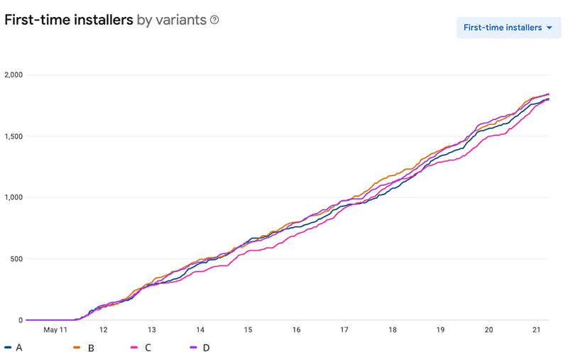
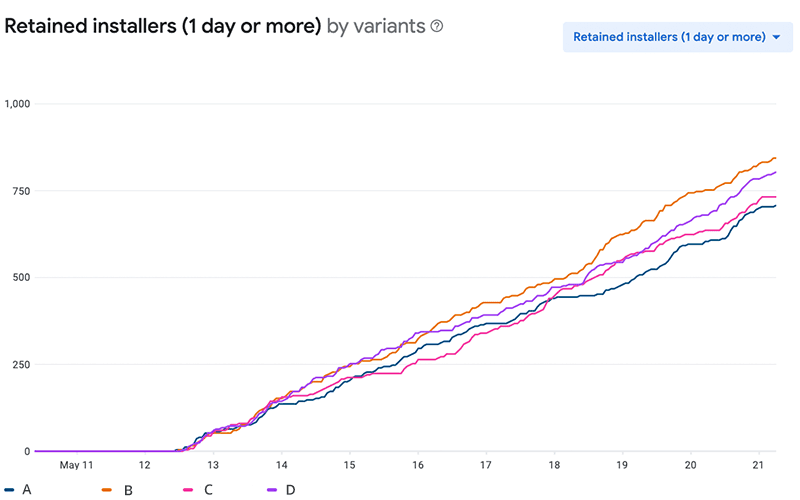
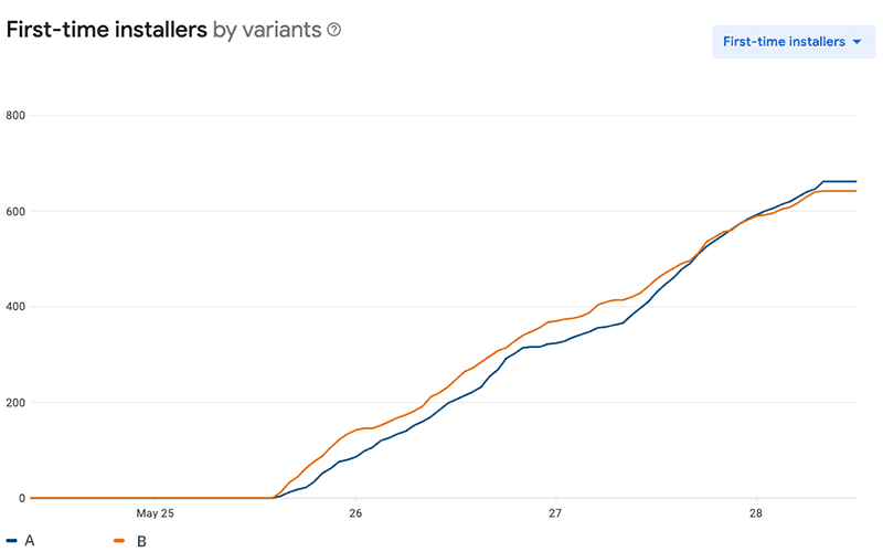
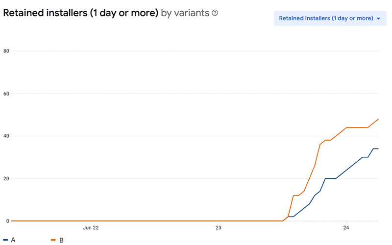
12th February 2021: A/B testing with app icons
As previously explained, the app icon is one of the first points of contact for a user in the app stores. In the test below, the existing app icon (A) was tested against variants B, C, and D.
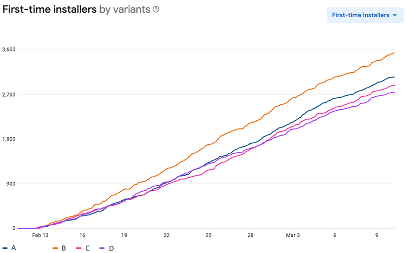
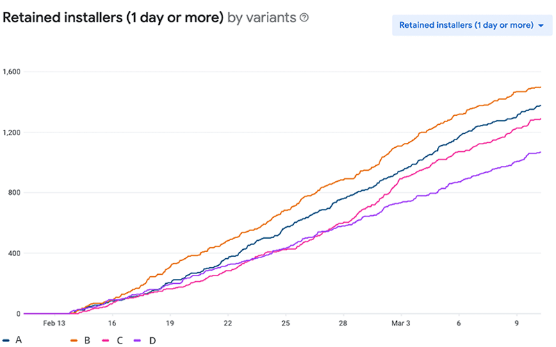
The A/B test revealed that variant B resulted in a 16.0% increase in first-time installers and 9.0% more retained installers.
|
Icon |
Variant |
First-time installers |
Retained installers |
|
|
A |
762 |
344 |
|
|
B |
884 |
375 |
|
|
C |
811 |
339 |
|
|
D |
710 |
301 |
12-03-2021: A/B Testing with App Screenshots
App screenshots are promotional images that showcase the functionalities of an app to potential users. You can simply upload 'screenshots' of the app, or you can choose to enhance the images in a smart and attractive way. In the A/B test conducted, the focus was on highlighting the key functionalities of VoNo.
The A/B test revealed that variant B led to a 16.0% increase in first-time installers and a 9.0% increase in retained installers.App screenshots are promotional images that showcase the functionalities of the app to potential users. You can simply upload 'screenshots' of the app, or you can choose to enhance the images in a smart and attractive way. In the A/B test conducted, the focus was on highlighting the key functionalities of VoNo.
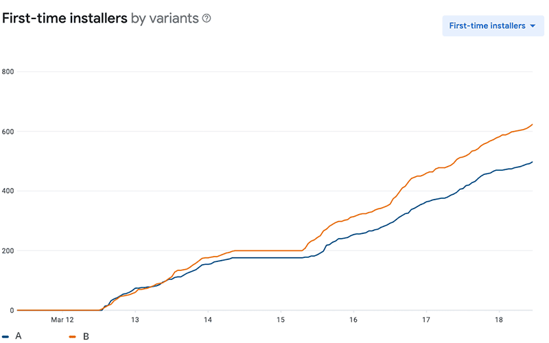
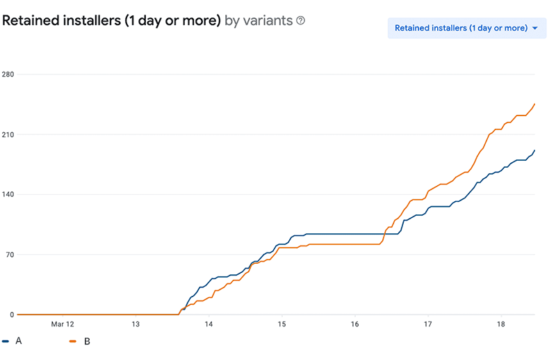
|
Screenshot |
Variant |
First-time installers |
Retained installers |
|
|
A |
249 |
96 |
|
|
B |
312 |
123 |
From this A/B test, it was found that the screenshots, where the USP’s (Unique Selling Points) were more clearly defined in the first 'screenshot', achieved more 'first-time' and 'retained installers'. Variant B resulted in a 25.3% increase in first-time installers and a 28.1% increase in retained installers, thanks to just one A/B test.
11-05-2021: A/B Testing with the Feature Graphic
A feature graphic is a required element to publish your app on the Google Play Store. The feature graphic is also a great way to visually showcase the USP’s (Unique Selling Points) of your app or game and attract new users. DTT has already conducted several A/B tests around the feature graphic for VoNo.
In the A/B test for the feature graphic, the focus was on highlighting different USP’s and the existing feature graphic (A) was tested against: Memo tool (B), Memo + mail (C) and Memo notebook (D).
|
Feature graphic |
Variant |
First-time installers |
Retained installers |
|
|
A |
451 |
177 |
|
|
B |
459 |
211 |
|
|
C |
450 |
183 |
|
|
D |
461 |
201 |

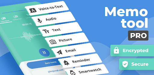
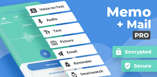
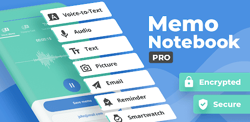
The results show that the Memo notebook (D) variant was the most effective in attracting first-time installers, but Memo tool (B) was the most effective at retaining users. For this reason, option B Memo tool was selected. Compared to the old feature graphic, retained installers were 19.2% higher.
25-05-2021: A/B Testing with a Video I
Within the Google Play Store, it is possible to add a video to the Play Store listing page. A video is not required to publish an app, but it can help attract the attention of potential users and inform them about what to expect from the app, so they know whether it fits their needs. In this A/B test, the VoNo Play Store listing without a video was tested against a version with a video. The A/B test revealed that the app retained more installers with a video on the Play Store listing.

|
Variant |
First-time installers |
Retained installers |
|
A (without video) |
331 |
103 |
|
B (with video) |
321 |
117 |
22-06-2021: A/B Testing with a Video II
After the positive result of the first video A/B test, a second A/B test was conducted with an updated video. The goal of the second test was to achieve more first-time and retained installers.

|
Variant |
First-time installers |
Retained installers |
|
A (old video) |
314 |
114 |
|
B (new video) |
328 |
121 |
The results of this second A/B test revealed that the new video resulted in a 4.4% increase in first-time installers and a 5.4% increase in retained installers. Thanks to this, the new video was chosen for the Play Store listing.
The Impact of A/B Testing
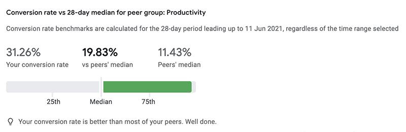
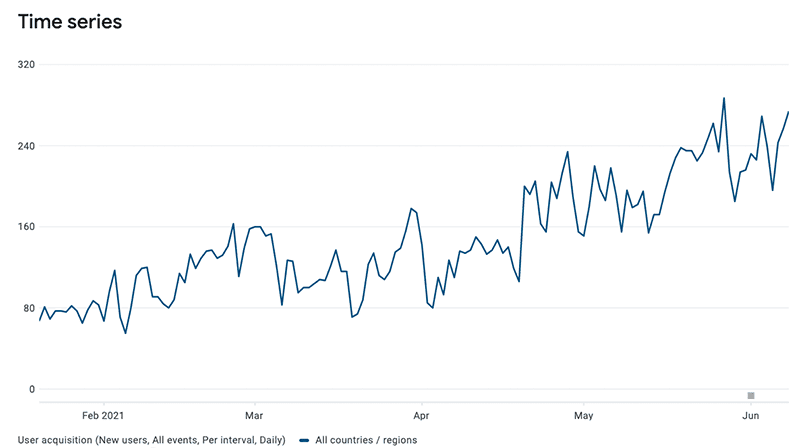
At VoNo, the number of users increased from over 80 to more than 240 per day within six months. The store listing acquisition shows how many users who viewed the app in the Play Store subsequently downloaded it. After extensive A/B testing, store listing acquisition rose by 129.8%. When we express store listing acquisition as a conversion rate (how often the app is downloaded compared to the total number of VoNo Play Store page visitors), the rate stands at 31.26%. This is more than 10% higher than other apps in the Productivity category. This progress was achieved without a single app update or promotion, just the power of App Store Optimisation (ASO), and this is only the beginning.
From Gut Feeling to Data-Driven Development for Your App Idea
If you’ve become excited about the possibilities of data-driven development using analytics after reading this article, feel free to get in touch with us if you have any questions. We’re happy to assist you at DTT. Would you like to discuss this further or brainstorm? Feel free to contact us.